Improved how homebuyers explore, customize, and price new homes, resulting in a 24% increase in conversions
A redesign of Ownly's Build & Price experience — transforming a fragmented flow into a clear, step-based journey through user research and close collaboration with engineering.
The problem we needed to solve
Buyers struggled to understand pricing, options, and tradeoffs in a complex build-and-price flow, leading to hesitation and drop-off.
As Lead UI/UX Designer on the Build & Price initiative, I…
- •Researched buyer behavior through interviews, Hotjar analysis, and competitive audits.
- •Led cross-functional workshops to align the team on user pain points, business needs, and priorities.
- •Defined the design strategy and navigation model for the new Build and Price experience.
- •Created and tested prototypes with customers, buyers, and internal stakeholders.
- •Delivered detailed specifications and acceptance criteria to support engineering implementation.
- •Supported development from design through release including QA reviews, A/B testing, and conversion analysis.
Listening to Buyers to Understand Friction
Before redesigning Build and Price, I reviewed dozens of Hotjar sessions to understand where the existing experience was breaking down. Users struggled to find the right home model, felt overwhelmed when customizing, and often got lost due to unclear navigation and industry terminology.
Interviews with builder customers surfaced similar themes. The interface felt dated, the fidelity reduced trust, and buyers lacked key features already planned for the roadmap.
Low Conversions and Buyer Abandonment in the Purchase Journey
The original Build and Price experience had low Save conversions, the key step required for buyers to create an account and continue their purchase journey.
User sessions showed clear issues:
- •Confusing navigation that caused buyers to backtrack or get lost
- •Industry terminology that created hesitation
- •Fragmented steps that added unnecessary cognitive load
- •Drop-off before reaching customization and the Save step
As a result, most buyers abandoned the flow before creating a profile, which directly affected lead generation and qualification.
Core Issues Holding Buyers Back
Builders noted that buyers expect a smooth, self-guided digital experience, yet the original Build and Price often fell short and created friction in sales conversations. From research and internal analysis, four core friction areas surfaced.
Unclear navigation
Buyers frequently lost their place in the flow and weren't sure what step came next.
Low-fidelity UI
The original interface lacked visual clarity and polish, reducing trust in a high-value purchase.
Confusing terminology
Industry terms caused hesitation and stalled progress.
Missing high-value features
Buyers wanted stronger filtering and easier lot selection, both critical for decision-making.
These insights set the foundation for our design goals: improve usability, simplify language, enhance visual fidelity, and elevate the discovery-to-customization journey.
Getting a Clear Picture of the Current Experience
We started by mapping how the existing Build and Price flow worked so the team had a shared understanding of the features, rules, and gaps.
Studying Real Behavior
We analyzed extensive Hotjar data to understand where users spent their time. The highest friction occurred in two critical areas:
- •Finding a suitable home model
- •Exploring customization options
This insight helped us prioritize where improvements would drive the greatest impact.
Prioritizing High-Value Features
Interviews with home builder customers revealed two roadmap features that offered outsized value with low engineering lift:
- •Improved filtering for home types
- •Transform and improve lot-selection experience
By aligning early with engineering, we ensured these features could ship within the redesign timeline.
Learning from "Big-Ticket" Industries
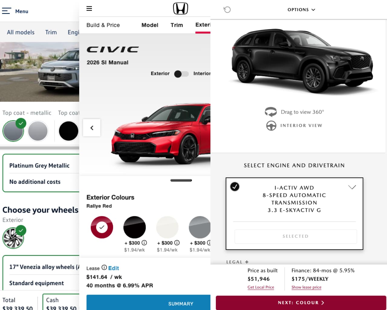
To improve navigation, we reviewed Build and Price flows from other high-consideration industries, especially automotive. Car manufacturers use clear step-based navigation, and applying that model helped early testers move through our flow with confidence.
Iterating Toward Confidence
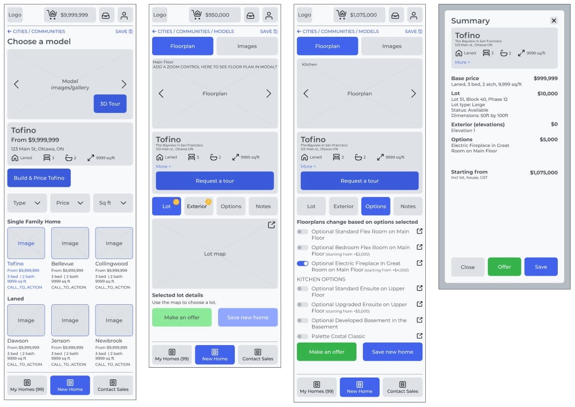
Through multiple rounds of testing, the flow became noticeably clearer. Users moved forward and backward without confusion, language barriers were reduced, and the interface took on a sharper and more modern feel. Each iteration brought the experience closer to what buyers expected.
A More Intuitive Home-Buying Journey
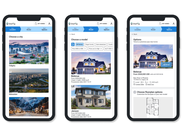
The redesigned Build and Price experience gives buyers a smoother path from discovery to customization. It brings clarity to each step, helps buyers understand their options, and supports more confident decisions as they explore models, features, and pricing.
1 — Step-Based Navigation
A linear navigation model inspired by automotive UX allows buyers to move forward and backward without losing context.
2 — Intuitive Customization Flow
Buyers can now explore floorplans, options, elevations, and pricing adjustments with clarity and transparency.
Measurable Impact Through A/B Testing
The redesigned Build & Price was A/B tested against the original experience for 1 month resulting in strong results:
24% increase in Save conversions
More buyers successfully completed the flow and created Ownly accounts.
32% increase in customization engagement
Users explored deeper into the experience and interacted with more options.
Improved navigation clarity
No significant confusion in forward/backward movement during usability testing.
Lessons That Shaped the Final Experience
This project showed how strongly interface clarity influences buyer trust. Creating a better Build and Price experience meant understanding buyer behavior, business needs, and technical constraints at the same time.
Building the Right Foundation
Mapping the Build and Price system early gave the team a shared view of how it worked and where it needed improvement. That clarity helped us make better decisions in a fast-paced environment.
Learning from Adjacent Industries
Studying automotive and other high-consideration purchase flows helped us see the problem differently. Their step-based navigation model gave us a clearer direction for our own buyers.
Testing Early and Often
Testing low-fidelity concepts early helped us refine ideas before moving into detailed design. Small changes to language, layout, and sequencing made the flow easier for buyers to navigate.
Designing for Confidence
Buyers needed an experience they could trust. When the steps, terms, and pricing are easy to understand, they are more comfortable continuing with a decision as significant as a new home.